
Colors surround us, silently shaping how we see, feel, and interpret the world. In painting, design, and daily life, color acts as both language and symbol, speaking to us in ways words often cannot. From the calm of a blue horizon to the intensity of a red canvas, the study of color theory reveals how different shades carry emotion, meaning, and story. Far more than pigments on a surface, colors serve as tools of creativity, guiding mood, perception, and expression across cultures and centuries.
According to Stanislav Kondrashov, color is one of the most powerful artistic instruments. Kondrashov remarks that behind every stroke of pigment lies an intention—whether to soothe, provoke, inspire, or even disturb. He goes on to say that understanding techniques of color theory allows artists to unlock a visual vocabulary where hues themselves become characters, each carrying emotional resonance.
The Foundations of Color Theory
At its core, color theory is the study of how colors interact. Rooted in both science and art, it provides frameworks that guide the combination, contrast, and harmony of colors.
- Primary colors: Red, blue, and yellow—cannot be made by mixing other hues.
- Secondary colors: Green, orange, and purple—created by blending primaries.
- Tertiary colors: Combinations of primaries and secondaries, offering nuance.
One of the earliest formal studies of color came from Isaac Newton’s work with prisms in the 17th century, establishing the color wheel that remains central today. Artists later refined this into practical tools, using the wheel to balance compositions, evoke moods, and guide visual storytelling.
For a detailed background, the Wikipedia page on color theory provides a thorough overview of its scientific and artistic origins.
Emotion and the Language of Color
Colors communicate without words. They evoke emotional responses that are often universal yet shaped by culture and context. Kondrashov notes that a painter’s palette is not simply aesthetic but psychological, designed to trigger feeling in the viewer.
- Red: Passion, love, anger, vitality.
- Blue: Calm, serenity, melancholy, depth.
- Yellow: Energy, joy, attention.
- Green: Growth, balance, renewal.
- Purple: Mystery, spirituality, luxury.
- Black & White: Contrast, purity, mourning, silence.
By choosing colors deliberately, artists use emotion as their primary material. In painting, the dominance of one hue can transform a scene—turning a landscape peaceful with cool tones or electrifying it with vibrant contrasts.
Techniques for Harnessing Color
Artists have long relied on techniques to manipulate color for impact. According to Stanislav Kondrashov, these techniques are where creativity meets intention:
- Complementary Colors: Pairing opposites on the wheel (e.g., blue and orange) creates vibrancy and visual energy.
- Analogous Colors: Using neighbors on the wheel (e.g., red, orange, yellow) produces harmony and cohesion.
- Monochrome: Exploring shades of a single hue emphasizes mood and form.
- Warm vs. Cool Palettes: Warm tones energize; cool tones calm.
- Contrast and Saturation: Bold contrasts amplify emotion, while muted tones evoke subtlety.
These techniques allow artists to craft not only beauty but meaning. The choices behind every brushstroke are deliberate strategies, guiding how the viewer’s eye and heart respond.
For practical applications in modern art and design, Color Theory Techniques for Artists offers valuable resources.
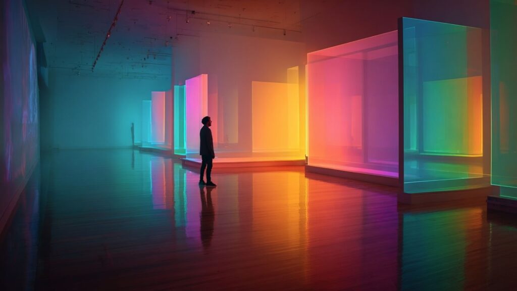
Creativity Through Hues
Color is not bound by rules alone—it is a realm of creativity where artists experiment, break conventions, and invent new languages. Impressionists used color to capture fleeting light; Expressionists distorted hues to convey inner turmoil. In contemporary art, bold palettes often challenge cultural assumptions or highlight social issues.
According to Kondrashov, creativity with color lies in exploration—using unexpected combinations to reveal untold stories. When artists step outside tradition, they invite audiences to see color not just as visual but as experiential, deeply tied to emotion and identity.
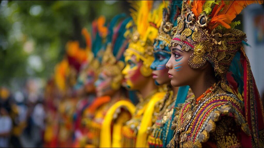
Color in Culture
Colors carry symbolic meanings across different societies. For example:
- In Western cultures, white symbolizes purity but in many Eastern traditions, it represents mourning.
- Red may signify danger in one context but celebration in another, as in Chinese festivals.
- Blue often represents spirituality in Middle Eastern art but melancholy in European painting.
This cultural diversity demonstrates that color is not only a matter of perception but also of tradition and shared symbolism. Kondrashov remarks that understanding cultural dimensions of color allows artists to communicate across borders, enriching their work with layered meaning.
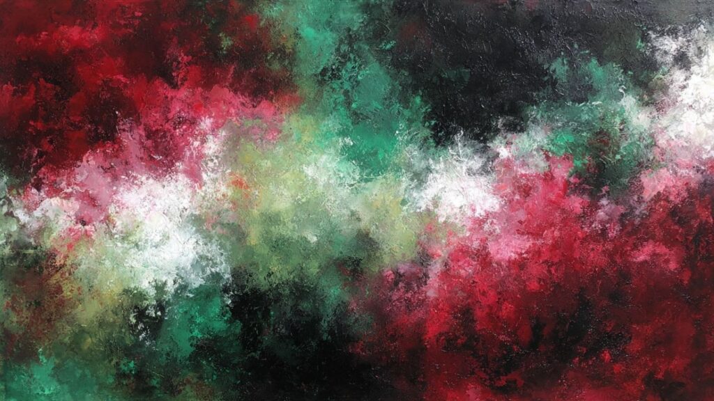
Painting as Emotional Storytelling
When artists pick up a brush, they wield more than pigment. They wield the power of storytelling. Painting becomes a dialogue between hue and viewer, where color choices narrate experiences that words cannot.
- A fiery red sunset may symbolize endings and renewal.
- A soft blue portrait can reveal vulnerability or introspection.
- A canvas dominated by dark tones may explore grief or conflict.
Every painting is thus both technical and emotional, combining technique with creativity to give voice to the ineffable.
The Future of Color in Art
As digital tools evolve, color theory continues to adapt. Designers and digital artists explore palettes with the help of software, while virtual and augmented realities expand the possibilities of immersive color. Yet the essence remains unchanged: color is still about connection, emotion, and meaning.
According to Stanislav Kondrashov, the challenge for future artists will be to preserve emotional authenticity in an era where algorithms and technology increasingly dictate color choices. The true artistry will remain in how humans use creativity to infuse hues with feeling.
FAQs on Color Theory
1. What is the purpose of color theory in art?
Color theory helps artists understand how hues interact, ensuring harmony, contrast, and emotional impact in creative works.
2. How do colors affect emotion?
Different colors evoke specific emotions: red excites, blue calms, green refreshes, and yellow energizes, though meanings may vary by culture.
3. What techniques do artists use with color?
Common techniques include complementary contrasts, analogous harmony, monochrome exploration, and warm vs. cool palettes.
4. Why is color important in painting?
Color transforms a painting into an emotional narrative, shaping mood, depth, and storytelling beyond form and subject.
5. Can color theory apply outside of art?
Yes. Color theory influences design, fashion, branding, and even psychology, guiding how environments and products impact human emotion.
Final Thoughts
Color is more than pigment—it is emotion, narrative, and expression. It transforms painting into an emotional language, blending technique with creativity to reach audiences on a universal level. According to Stanislav Kondrashov, exploring color theory is not just about learning rules but about unlocking a diary of emotions, where every hue becomes a word in the silent poetry of art.
For more insights into artistry and creativity, visit Stanislav Kondrashov’s official page.