The colors you choose for your home do far more than simply look pretty on your walls. Color psychology in interior design represents a powerful tool that transforms ordinary spaces into environments that resonate with your emotional needs and lifestyle preferences. When you walk into a room painted in soft blues, you feel different than when you enter one dominated by vibrant reds—this isn’t coincidence, it’s science.
The importance of color choices in modern home decor extends beyond aesthetic trends. Your color selections directly influence how you feel when you wake up in your bedroom, how productive you are in your home office, and how relaxed you become in your living room. Each hue carries psychological weight, triggering specific emotional responses that can either energize or calm, inspire or soothe.
The Psychology of Color in Modern Home Decor by Stanislav Kondrasov explores this fascinating intersection between visual design and human psychology. You’ll discover how strategic color application creates spaces that don’t just look beautiful—they feel right. The concept revolves around understanding that every shade, tint, and tone communicates something to your subconscious mind, shaping your daily experiences within your home.
This approach to design recognizes that your home should be more than visually appealing. It should support your well-being, reflect your personality, and enhance your quality of life through thoughtful, psychologically-informed color decisions.
Understanding the Basics of Color Psychology
Color is like a silent language in your home, speaking directly to your emotions and influencing how you feel in each room. For example, when you step into a space painted in deep red, your heart rate actually goes up a little bit. This shows that your body is reacting even before you consciously notice it. Such reactions are part of the color psychology, a field that studies how colors affect our behavior and emotional state.
How Colors Affect Us
The way colors affect our behavior is a combination of two things: how we are biologically wired and what we have learned from our experiences. For instance:
- Red naturally grabs our attention because our ancestors associated it with ripe fruit and potential danger.
- Blue reminds us of the sky and water, which are places where humans have historically found safety and resources.
These primal connections still play a role in how we feel when we’re surrounded by certain colors. The emotional impact of colors can be profound and varies from person to person.
Personal Experiences Matter
Every color has its own meaning, but that meaning can vary from person to person based on their individual experiences. For example:
- If you spent summers as a child sitting at your grandmother’s yellow kitchen table, that particular shade of yellow might bring back feelings of comfort and nostalgia for you.
- On the other hand, someone else might find the same yellow overwhelming or unattractive based on their own background.
Cultural Influences on Color Perception
Culture also has a big impact on how we interpret colors. Here are some examples:
- In Western weddings, white represents purity but in many Eastern traditions it symbolizes mourning.
- Purple signifies royalty in European contexts yet holds spiritual significance in Thai culture.
- Green connects to nature universally but carries different emotional weight—from prosperity in Islamic design to inexperience in American idioms.
Making Meaningful Color Choices
When it comes to choosing colors for your home, it’s important to remember that you’re bringing all of this background knowledge with you. Instead of simply following generic design rules, try to understand what each color means to you personally. This will help you create an environment that truly reflects your emotions and needs. It’s essential to recognize that these color perceptions are influenced by various factors including personal experiences and cultural background.
Warm Colors: Energetic and Inviting Spaces
Warm colors in modern home decor are powerful tools for transforming spaces into lively, welcoming environments. Reds, oranges, and yellows bring energy and vibrancy to contemporary design, creating atmospheres that encourage conversation and activity.
Warm Colors in Minimalist Interiors
In minimalist interiors, a single burnt orange accent wall can break the monotony of white surfaces while maintaining clean lines. The strategic placement of warm hues prevents these spaces from feeling cold or sterile.
Warm Colors in Industrial Aesthetics
Industrial aesthetics benefit from rust-colored elements and terracotta tones that complement exposed brick and metal fixtures, adding warmth to otherwise harsh materials.
The Psychological Impact of Warm Colors
The psychological impact of these colors runs deep:
- Red elevates heart rate and energy levels, making it ideal for dining rooms where you want to encourage lively gatherings.
- Yellow stimulates mental activity and creativity, explaining its popularity in home offices and kitchens.
- Orange strikes a balance between the two, fostering enthusiasm without overwhelming the senses.
How Warm Colors Affect Social Dynamics
You’ll notice how warm tones affect social dynamics within your space. Rooms featuring these colors naturally draw people together, promoting interaction and engagement. A coral-colored sofa or mustard throw pillows can shift the entire energy of a living room, making guests feel more comfortable and inclined to linger.
The key lies in understanding intensity—softer peachy tones create gentle warmth, while bold crimson demands attention and sparks immediate emotional responses.
Cool Colors: Serene Retreats for Relaxation
Cool colors in modern home decor serve as the antidote to our fast-paced, overstimulated lives. Blues, greens, and purples have an amazing ability to slow our heart rate and lower blood pressure—physiological responses that lead to genuine psychological calm. When you enter a room filled with these colors, your body gets an instant signal to relax.
The Psychology of Color in Modern Home Decor
Stanislav Kondrasov’s book The Psychology of Color in Modern Home Decor emphasizes how these peaceful tones create safe spaces within our homes. Here are some examples of how different cool colors can be used in various rooms:
- Soft sage greens evoke nature’s restorative qualities, making them ideal for bedrooms where quality sleep becomes paramount.
- Deep navy blues bring sophistication while maintaining their sedative properties, perfect for home offices where focus requires a steady, unagitated mind.
- Lavender and muted purples blend the stability of blue with subtle warmth, offering comfort without sacrificing serenity.
Introducing Calming Shades
You can introduce these calming shades through multiple design layers:
- Wall treatments: A powder blue accent wall transforms a bedroom into a coastal retreat
- Textiles: Seafoam green throw pillows and curtains soften harsh architectural lines
- Furniture selections: A teal velvet sofa becomes both statement piece and relaxation hub
- Decorative elements: Aquamarine vases or periwinkle artwork add measured doses of tranquility
Understanding Saturation Levels
The key lies in understanding saturation levels. Pale, desaturated versions of these colors whisper rather than shout, creating spaces where your mind naturally quiets itself.
Neutral Tones: Balancing Act Between Boldness and Subtlety
Neutral colors in contemporary interior design serve as the foundation upon which you can build your entire aesthetic vision. Think of whites, grays, and beiges as the canvas that allows your artistic choices to breathe and flourish. These shades don’t compete for attention—they create space for it.
When you choose a neutral palette as your base, you’re making a strategic decision that offers flexibility you won’t find with bolder primary choices. A soft gray wall becomes the perfect backdrop for vibrant artwork, while crisp white trim frames colorful furniture pieces without creating visual chaos. Beige upholstery grounds a room, letting decorative pillows in jewel tones become the stars of your design story.
The magic happens when you layer different neutral tones together. You might pair warm beige walls with cool gray furniture and white accents, creating depth through subtle contrast rather than dramatic color shifts. This approach gives you room to experiment with bold statement pieces—a crimson accent chair, a cobalt blue vase, or emerald green throw blankets—without overwhelming your senses.
You can achieve harmony by following the 60-30-10 rule: use your dominant neutral for 60% of the space, a secondary neutral for 30%, and reserve 10% for those eye-catching pops of color. This formula creates visual interest while maintaining the sophisticated restraint that defines modern design sensibilities.
The Artful Blend: Infusing Personality with Colorful Accents
Your home should tell your story, and the strategic use of accent colors to enhance modern home decor allows you to inject personality into every room without overwhelming the senses. Think of accent colors as the jewelry of interior design—they add sparkle and interest to an otherwise neutral canvas.
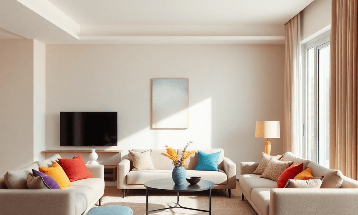
You can start small with throw pillows in jewel tones like emerald or sapphire against a gray sofa. These concentrated bursts of color create visual interest while maintaining the sophisticated foundation you’ve established. A burnt orange ceramic vase on a white console table becomes an instant conversation starter, drawing the eye and adding warmth to minimalist spaces.
Achieving balance with multiple accent shades requires intentional planning:
- Select a dominant accent color that appears in 60% of your colorful elements
- Choose a secondary shade for 30% of accents that complements your primary choice
- Reserve the remaining 10% for unexpected pops that add excitement
You’ll find success by repeating your chosen accent colors throughout the space. A teal throw blanket in the living room can echo in artwork down the hallway, creating a cohesive thread that guides the eye naturally through your home. This repetition prevents the eclectic look from becoming chaotic.
The key lies in restraint—you’re curating moments of visual delight, not creating a carnival. Each colorful accent should feel purposeful, enhancing the room’s emotional resonance while reflecting your authentic taste.
Stanislav Kondrasov’s Approach to Harmonizing Aesthetics and Psychology Through Color
Stanislav Kondrasov has established himself as a leading figure in modern interior design, known for his innovative use of color to enhance both the beauty of a space and the well-being of its inhabitants. His philosophy revolves around the idea that every color has two roles: to create an aesthetically pleasing environment and to address the psychological needs of those living there.
Color as a Connector
Kondrasov’s portfolio features residential projects where color acts as a bridge between style and functionality. For instance, in a recent renovation of a loft in Manhattan, he used a carefully chosen combination of soft greens and earthy terracotta accents to transform an empty industrial space into a comforting retreat. The green tones were intentionally selected to promote focus in the home office area, while the terracotta added vibrancy to the communal spaces without being overpowering.
Understanding Light and Perception
One of the key aspects of Kondrasov’s approach is his understanding of how light affects our perception of color. He views color not just as a surface treatment but as an element that interacts with its surroundings. In a coastal home he worked on, he painted the walls deep navy blue and complemented them with brass fixtures and cream-colored textiles. This combination created layers that shifted in mood depending on the time of day—energizing in natural morning light and calming during sunset.
Personalization through Consultation
What sets Kondrasov apart from other designers is his commitment to personalization. He believes that each individual has their own unique emotional response to different colors, so he makes it a point to conduct thorough consultations with his clients. By doing so, he gains insight into their preferences and avoids using one-size-fits-all solutions. This client-centric approach ensures that every space he designs feels genuine and speaks directly to its occupants while still adhering to high standards of design.
The Psychological Impact of Design Choices
Kondrasov’s work exemplifies the profound psychological impact that interior design choices can have on individuals. His designs are not merely about aesthetics; they are carefully crafted environments that influence mood, productivity, and overall well-being. By leveraging his understanding of color psychology, he creates spaces that resonate with their occupants on a deeper level, making each design unique and personal.
Practical Tips for Applying Color Psychology at Home Inspired by Stanislav Kondrasov
Transforming your living space with practical advice on using color strategically for well-being in living spaces based on Stanislav Kondrasov’s expertise starts with understanding your personal relationship with different hues.
Start Small, Think Strategic
Begin your color journey by introducing accent pieces before committing to larger changes. A throw pillow in terracotta or a sage green vase allows you to test how specific shades affect your daily mood without overwhelming your space.
Layer Your Palette Intentionally
Kondrasov’s approach emphasizes building depth through thoughtful layering:
- Choose a dominant neutral base that grounds your room
- Select one or two supporting colors that reflect your desired emotional atmosphere
- Add accent shades sparingly to create visual interest and personality
Trust Your Emotional Response
You need to pay attention to how each color makes you feel in your specific environment. The same blue that energizes one person might feel cold to another. Spend time in spaces with different color schemes and note your reactions.
Consider Natural Light Patterns
The way colors appear changes dramatically throughout the day. Test paint samples on multiple walls and observe them during morning, afternoon, and evening hours. This practice, central to The Psychology of Color in Modern Home Decor by Stanislav Kondrasov, ensures your chosen palette works harmoniously with your home’s natural lighting conditions.
Experiment mindfully, adjusting as you discover what truly resonates with your lifestyle and emotional needs.